A Shaping Conflict
overview
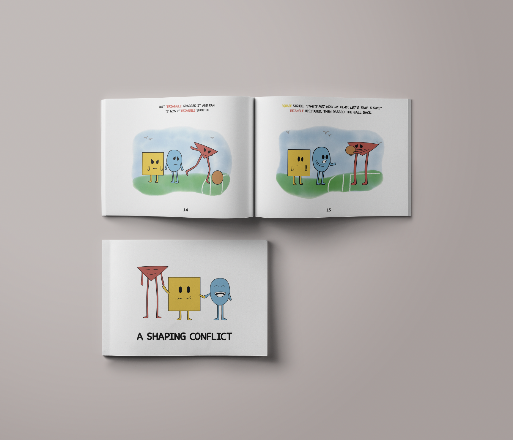
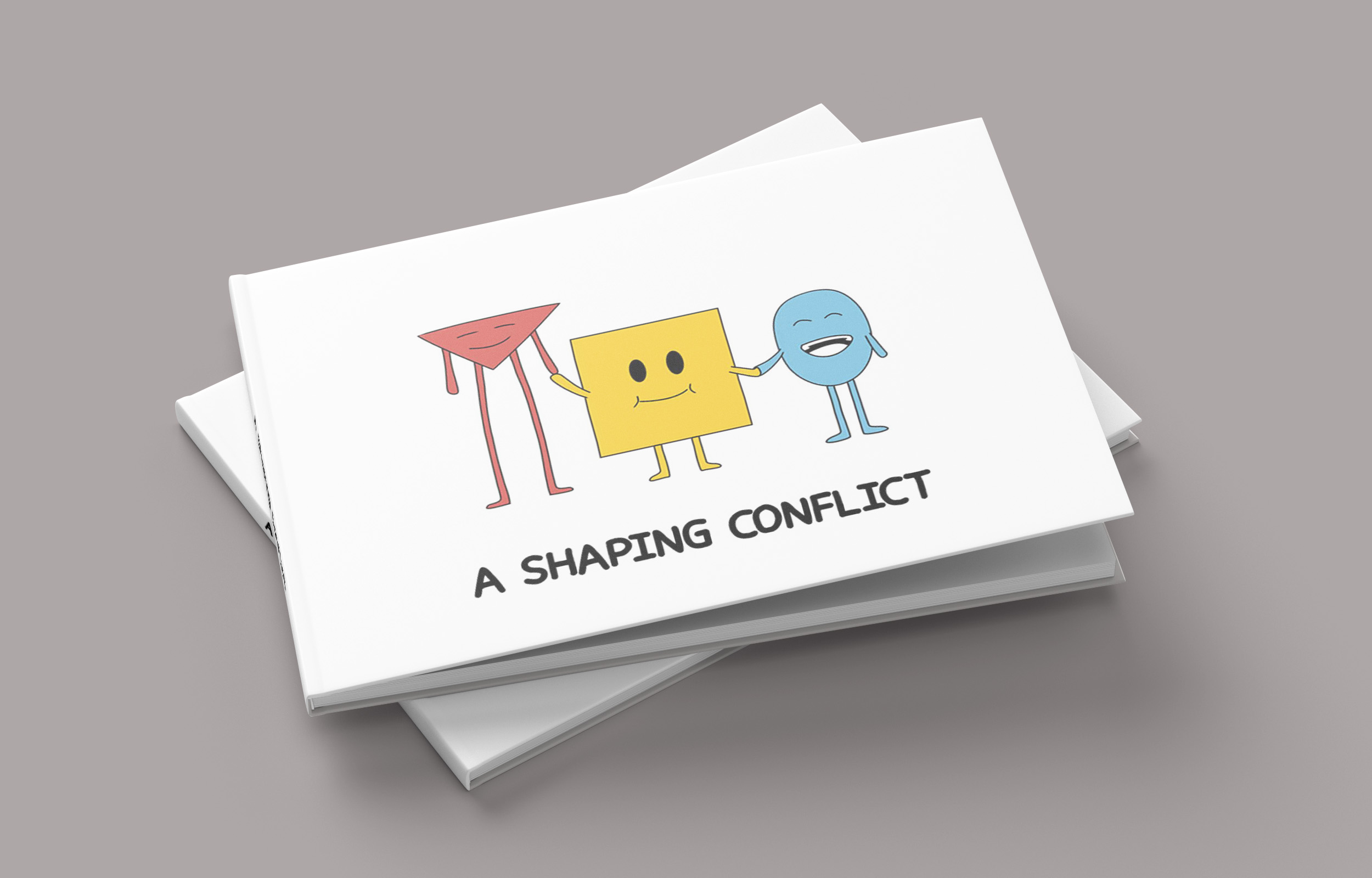
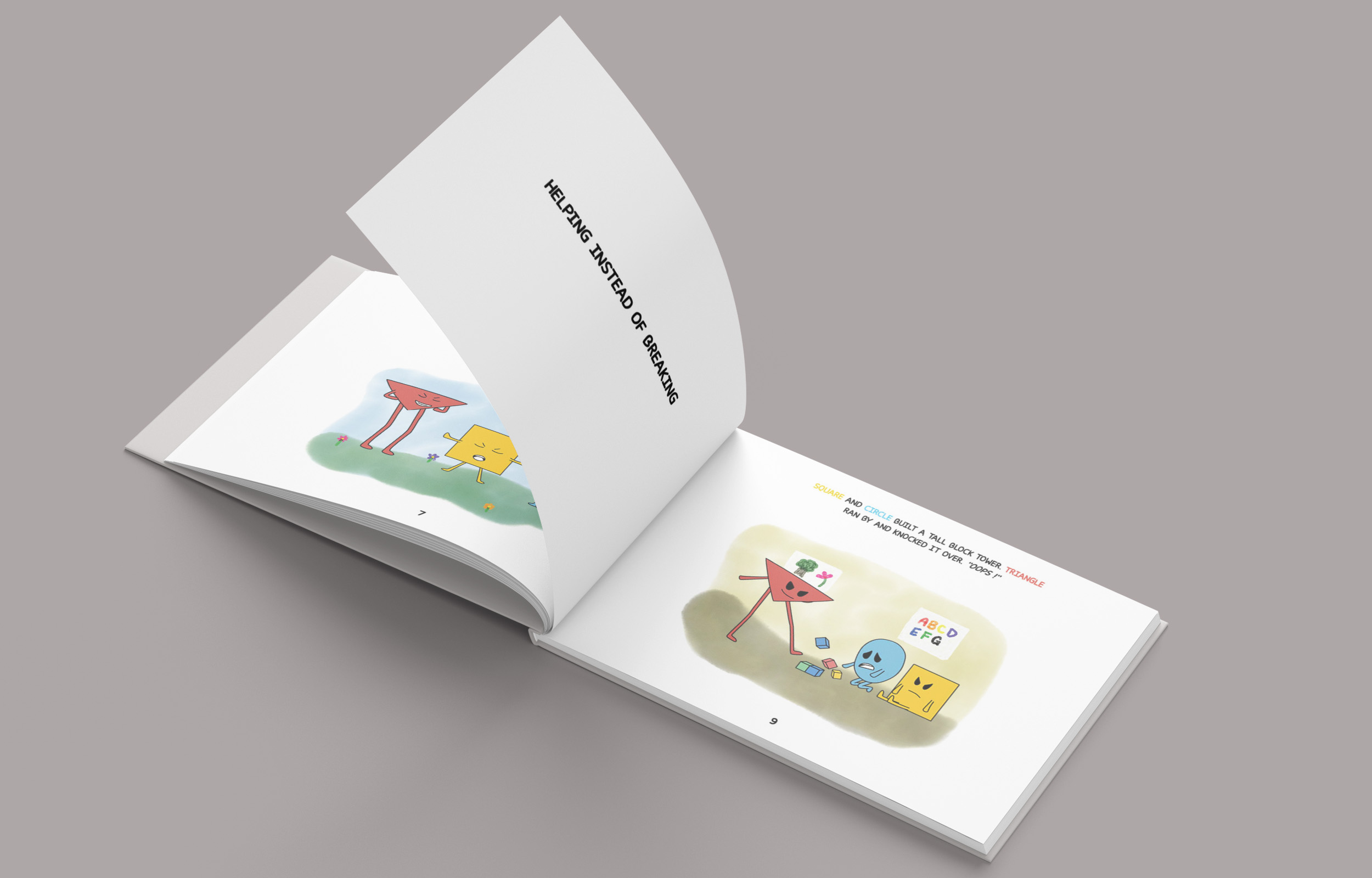
This project was for my psychology class, I worked with Amandine, Kirsten, and Jayvee. My team and I created a children’s book designed to teach young children about conflict resolution. While conflicts occur at all ages, we chose to focus on early childhood, as young children often face everyday challenges such as not wanting to share, taking things without asking, or crossing personal boundaries. Through relatable characters and simple real-life scenarios, the book aims to help children recognize conflict and begin to develop basic problem-solving and social skills.
project info
March 2025
Group Project
tools
project info
March 2025
Group Project
tools
overview
This project was for my psychology class, I worked with Amandine, Kirsten, and Jayvee. My team and I created a children’s book designed to teach young children about conflict resolution. While conflicts occur at all ages, we chose to focus on early childhood, as young children often face everyday challenges such as not wanting to share, taking things without asking, or crossing personal boundaries. Through relatable characters and simple real-life scenarios, the book aims to help children recognize conflict and begin to develop basic problem-solving and social skills.
challenge
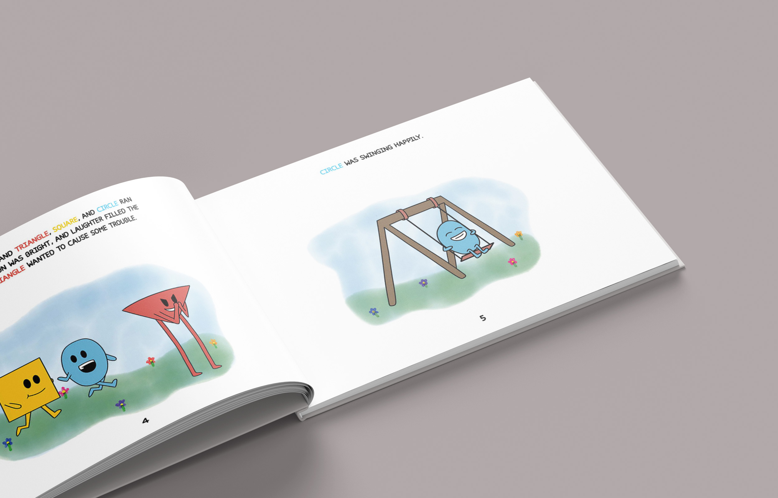
One of the main design challenges I faced was creating background illustrations that wouldn’t distract from the main characters, since the goal of the book was to clearly show conflict situations that children could relate to. The backgrounds had to be visually supportive without becoming the focal point. I also had to carefully choose colors that were eye-catching and appealing to children, while still keeping the overall look simple and clear. Balancing visual interest with clarity was key to making sure the story remained the main focus.
my roles
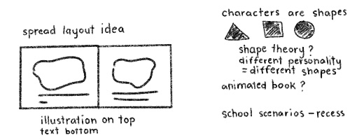
My role in this project mainly involved creating the background illustrations for each “case” presented in the book. I was responsible for visually setting the scene in a way that would be engaging and easy for children to understand. In addition to the illustrations, I also collaborated with Amandine on the overall layout of the book, helping with the organization of text and images to make sure the story flowed clearly and was visually appealing. This project was done in one week.
solutions
To solve this challenge, I designed soft and simple backgrounds using a watercolor brush on Adobe Fresco to create a dreamy, gentle atmosphere. This style helped support the story without distracting from the characters, allowing the focus to stay on the emotions and conflicts in each scene. Every background was carefully created with colors and composition that would catch a child’s eye while still feeling calm and balanced.